

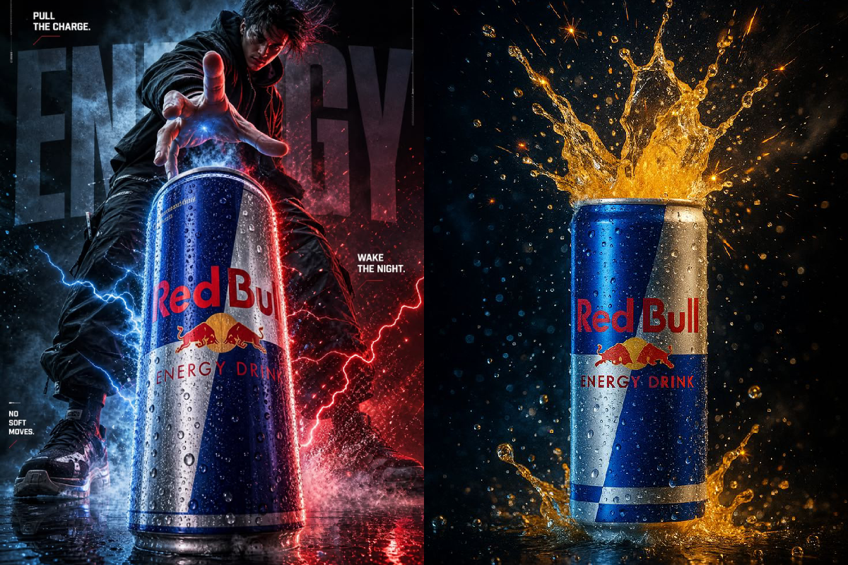
Some advertisements sell a product. Others create an entire atmosphere around it. This Red Bull-inspired visual is a perfect example of how energy, movement, colour and storytelling can transform a simple beverage into a dramatic visual experience.
The split composition combines a high-intensity action scene with a striking product shot, creating two very different interpretations of the same brand identity.
Energy Meets Cinematic Storytelling
The first image immediately creates a sense of movement and intensity.
A dramatic figure reaches toward the can while blue and red lighting, lightning effects and reflections fill the frame. The composition feels closer to a movie poster than a conventional beverage advertisement.
The visual message is built around ideas of:
- Power
- Speed
- Energy
- Determination
- Action
- Night-time intensity
The large can placed in the foreground becomes the central visual anchor.
The Product Takes Centre Stage
The second image takes a completely different approach.
Instead of a character-driven composition, the Red Bull can becomes the hero of the frame. A dramatic golden liquid splash surrounds it, contrasting strongly against the dark background.
This is a classic hero-product advertising technique: make the product unmistakable and surround it with visual elements that communicate its personality.
The metallic packaging also catches the light beautifully, helping the can remain the strongest focal point.
Blue, Red and Gold: A Powerful Colour Combination
Colour plays an important role across both visuals.
The first composition relies heavily on electric blue and red, creating a futuristic and energetic atmosphere.
The second shifts toward golden orange, producing warmth and a sense of explosive energy.
Together, the colours create a visual progression:
Blue → Red → Gold → Energy
This makes the two images feel connected even though their creative concepts are very different.
Why the Splash Works So Well
The liquid splash in the second image isn’t simply decorative.
It adds movement to an otherwise static product photograph. Every droplet helps create the impression that something has just happened—or is about to happen.
This technique is frequently used in beverage advertising because liquids can visually communicate qualities such as:
Freshness + Movement + Impact + Refreshment
The frozen droplets also add a premium commercial-photography feel.
The Power of a Strong Tagline
The first creative uses short phrases such as “PULL THE CHARGE” and “NO SOFT MOVES.”
Short copy works particularly well in high-impact advertising because the viewer can understand it almost instantly.
Instead of explaining the product, the messaging creates an attitude around it.
That is an important advertising principle:
Don’t just show the product. Build a personality around it.
From Product Photography to Brand Storytelling
What makes the visual interesting is that the two sides communicate different aspects of the same advertising idea.
The first side says:
Energy is an attitude.
The second says:
Energy is the product experience.
Combining the two creates a broader visual story rather than simply showing a can against a plain background.
The Importance of Lighting
Lighting is another major contributor to the dramatic appearance.
The first image uses contrasting red and blue illumination to create depth around the subject and product.
The second uses a darker environment with bright highlights on the can and liquid splash.
This type of controlled lighting helps the product stand out while giving the advertisement a cinematic finish.
A Simple Product Can Become a Visual Icon
At the centre of both concepts is something extremely simple: a beverage can.
But through scale, lighting, colour, composition, motion and effects, that ordinary object becomes the hero of the entire frame.
That’s the real strength of creative advertising.
A successful visual doesn’t necessarily need a complicated message. Sometimes it needs one recognisable product and one unforgettable visual idea.
Final Thoughts
This Red Bull-inspired creative demonstrates how modern advertising can sit somewhere between commercial photography, graphic design and cinematic storytelling.
From lightning and dramatic characters to explosive liquid splashes, every element is designed to make the viewer feel the energy before they even think about the product.
And that’s what makes a strong advertising visual memorable: the product isn’t just being shown—it is being turned into an experience.

Comments are closed.