

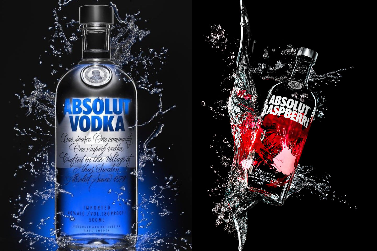
The Absolut Vodka visuals featured here take a bold, high-contrast approach, combining glass, liquid, colour and motion to turn the familiar bottle into the central character of the composition. One image leans into the brand’s signature blue identity, while the other introduces a vivid red-and-black treatment through a flavoured variant.
Together, they demonstrate how creative product photography can make packaging feel dynamic, premium and instantly recognisable.
The Bottle as the Hero
The most important element in both compositions is the bottle.
Its distinctive rounded shoulders and clear glass silhouette make it immediately recognisable. Rather than hiding the packaging behind elaborate props, the photography keeps the bottle firmly at the centre.
This is a powerful approach to product advertising:
When the packaging is distinctive, let the packaging tell the story.
Blue: The Signature Visual Language
The first composition is dominated by electric blue.
The blue lighting beneath the bottle creates a cool, sophisticated atmosphere, while the transparent glass allows reflections and highlights to become part of the image.
The surrounding water splash adds energy without taking attention away from the bottle.
The result is clean, dramatic and unmistakably contemporary.
Liquid Turns a Static Image Into Motion
The most striking feature of the first visual is the water surrounding the bottle.
Liquid is frozen mid-air, creating the illusion that the bottle has just emerged from a splash.
This technique gives the photograph an extraordinary sense of movement.
Instead of looking like a bottle sitting on a studio surface, the product appears to exist within an active environment.
That is the power of high-speed product photography—capturing a fraction of a second and turning it into an entire visual story.
Red Brings a Completely Different Energy
The second image changes the mood dramatically.
The red liquid and red lighting create a much warmer and more energetic atmosphere. Against the black background, the colour becomes intensely prominent.
The bottle appears tilted within a dramatic splash, giving the composition a sense of movement and spontaneity.
Compared with the blue visual, this treatment feels more expressive and theatrical.
Black Creates the Perfect Background
Both compositions make excellent use of black.
A dark background eliminates visual distractions and allows the bottles, liquid and highlights to dominate the frame.
It also creates strong contrast with:
- Blue lighting
- Red liquid
- Transparent glass
- White typography
- Bright reflections
This is a classic technique in premium product photography.
Darkness isn’t empty space—it creates room for the product to shine.
Packaging and Typography Work Together
The bold typography on the bottles is another important visual element.
Because the surrounding imagery is dramatic, the clear lettering provides a strong visual anchor.
The label remains readable even when surrounded by reflections and splashing liquid.
This demonstrates why successful packaging design needs to work not only on a shelf, but also within advertising, photography and digital media.
A Flavoured Variant Gets Its Own Personality
The second bottle demonstrates how a familiar brand identity can be adapted for a different product variant.
While the overall bottle shape remains recognizable, the red-and-black treatment creates a different mood.
This allows the product to maintain brand recognition while establishing its own personality.
It is an important branding balance:
Be recognizable enough to belong to the family, but distinctive enough to stand apart.
High-Contrast Photography for Digital Audiences
Images like these are particularly suited to digital platforms.
On websites and social media feeds, viewers often make decisions about whether to stop scrolling within seconds.
Strong contrast, saturated colour and unusual movement can immediately capture attention.
The combination of a recognizable bottle and dramatic liquid effects creates exactly that kind of visual interruption.
What Makes the Composition Work?
Several creative decisions contribute to the impact of these images:
1. Strong central subject
The bottle remains the hero.
2. Limited colour palette
Blue, red, black and white create a controlled visual language.
3. Motion
Water splashes make the image feel alive.
4. Contrast
Bright highlights stand out against the dark background.
5. Reflections
The glass and liquid create additional layers of light.
6. Minimal background
Nothing competes unnecessarily with the product.
These elements work together rather than independently.
The Art of Making a Bottle Look Cinematic
The visuals also demonstrate how beverage photography can borrow techniques from cinema.
Directional lighting creates depth. Frozen liquid creates action. Reflections add atmosphere. The dark environment creates tension.
The bottle is no longer simply an object.
It becomes the protagonist of a visual scene.
This approach is particularly effective for brands that want their advertising to feel energetic, modern and memorable.
Final Thoughts
The Absolut Vodka visuals show how powerful product photography can become when branding and visual storytelling work together.
The blue composition communicates coolness and precision, while the red composition introduces energy and drama. In both cases, liquid movement transforms a simple bottle shot into something far more dynamic.
The larger lesson extends beyond beverage advertising:
Great product photography doesn’t just show what you’re selling. It creates a world around it.

Comments are closed.