

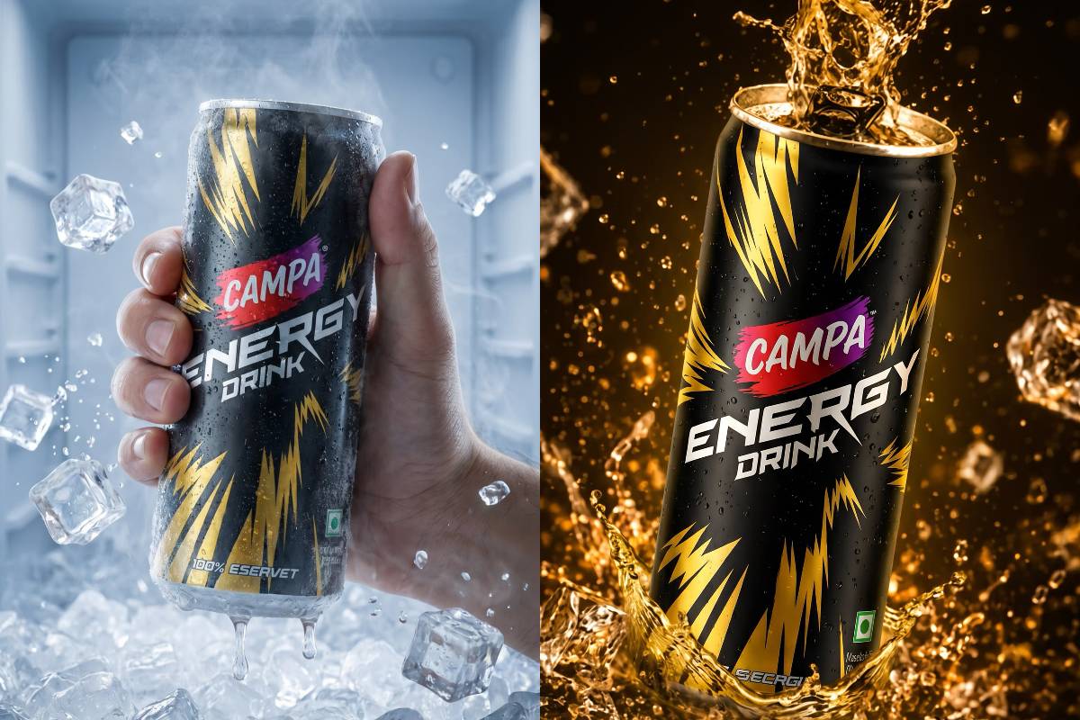
Energy drink advertising is all about creating a feeling before the first sip—and this visual does exactly that.
With its striking black can, electric yellow graphics and dramatic splashes of liquid, Campa Energy Drink is presented as a product built around intensity, refreshment and youthful energy.
A Can Designed to Stand Out
The first thing that grabs attention is the packaging.
The predominantly black can creates a strong, premium-looking base, while the bright yellow lightning graphics immediately communicate power and energy.
The red Campa branding provides another burst of colour, making the logo highly visible against the darker design.
It is a visual identity designed to catch the eye instantly.
Ice-Cold Energy
The left side of the image takes a refreshing approach.
The can is surrounded by ice cubes, condensation and splashing water, creating an unmistakable impression of cold refreshment.
The cool blue environment reinforces that sensation, making the product appear particularly appealing as a chilled beverage.
The droplets on the can add another layer of realism, suggesting that it has just been taken from an ice-cold setting.
From Ice to Fire
The right side completely changes the mood.
Instead of cool blue tones, the can is surrounded by golden liquid and dramatic splashes.
This creates an interesting visual contrast:
Left: Cold, crisp and refreshing.
Right: Warm, energetic and explosive.
The same product is therefore given two distinct personalities within a single composition.
Lightning Graphics Reinforce the Message
The yellow lightning-like graphics wrapping around the can are an important part of the visual storytelling.
Lightning is naturally associated with speed, electricity and power, making it a fitting design element for an energy drink.
Against the black packaging, the yellow graphics appear even more dynamic.
Dramatic Product Photography
The composition uses techniques commonly associated with high-impact advertising photography.
Suspended ice cubes, flying droplets and frozen splashes make the image feel energetic even though the product itself is stationary.
The right-side splash is particularly dramatic, creating the impression that the beverage has just exploded into motion.
This type of visual treatment turns an ordinary product shot into an attention-grabbing advertising concept.
Black, Yellow and Red: A Powerful Palette
The colour combination is another major strength.
Black provides depth and sophistication.
Yellow communicates energy and excitement.
Red draws attention to the Campa branding.
Together, these colours create a visual identity that feels bold, youthful and highly energetic.
A Product Made for Visual Impact
The image demonstrates how effective beverage advertising can rely on visual storytelling rather than excessive text.
There are no complicated explanations.
Instead, the message is communicated through:
- Ice and condensation
- Dynamic liquid splashes
- Lightning-inspired graphics
- Strong contrasting colours
- Dramatic lighting
- A prominent product composition
Everything points toward one central idea: energy in motion.
Final Thoughts
This Campa Energy Drink visual transforms a simple beverage can into the hero of a high-impact advertising scene.
From the icy blue refreshment of the first frame to the explosive golden splash of the second, the concept creates a powerful contrast while maintaining a consistent brand identity.
Cold or explosive, the visual message is unmistakable: energy takes centre stage.

Comments are closed.