

Johnnie Walker Red Label: An Iconic Name in the World of Whisky
Some brands become instantly recognisable through their packaging, heritage and distinctive visual identity. Johnnie Walker Red Label is one such name in the global whisky industry.
Recognised by its striking red label, amber-coloured spirit and iconic Striding Man emblem, the bottle has developed a distinctive identity that stands out in product photography and lifestyle editorials.
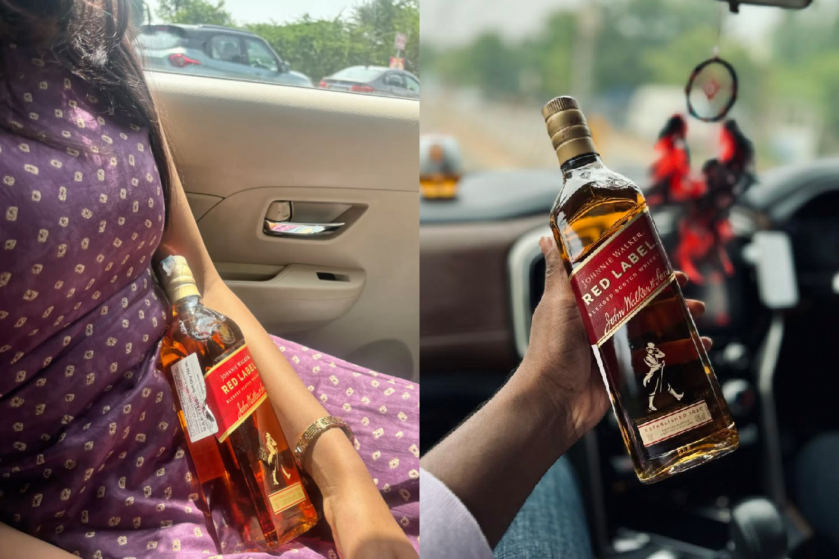
This visual editorial presents two different perspectives of the iconic bottle. One photograph captures it resting against a purple traditional-style outfit inside a car, while the other highlights the bottle held against a modern vehicle interior.
Together, the images explore the relationship between product presentation, personal style and contemporary lifestyle photography.
1. The Signature Red Label: Recognisable Branding
The first thing that attracts attention is the bottle’s distinctive red label.
The combination of bold typography, golden accents and the recognisable brand emblem creates a strong visual identity.
Its amber colour contrasts beautifully with the red packaging, making it particularly effective in close-up product photography.
2. Luxury Lifestyle Photography: Making Everyday Moments Visual
Lifestyle photography transforms ordinary objects into visually interesting subjects.
In the first photograph, the bottle is positioned against a purple patterned outfit, creating an interesting contrast between traditional clothing and a globally recognised whisky brand.
The second photograph uses a close-up composition, with the bottle held against a vehicle interior. The blurred background creates depth and keeps attention on the product.
These compositions demonstrate how lighting, framing and background selection can influence the visual impact of commercial photography.
3. The Importance of Packaging in Premium Branding
Packaging plays an important role in how consumers recognise established brands.
Johnnie Walker Red Label uses a combination of distinctive colours, typography and emblematic imagery to maintain its recognisable appearance.
The red-and-gold colour combination communicates a bold visual personality, while the bottle’s familiar shape reinforces its brand identity.
4. Red Label and the Evolution of Whisky Branding
The Johnnie Walker brand has a long history in the Scotch whisky industry.
Red Label is known internationally and forms part of a broader portfolio of Scotch whisky expressions.
Its recognisable presentation demonstrates how consistent visual branding can help a product maintain its identity across generations and international markets.
5. Product Photography: Lessons from This Editorial
The photographs offer several interesting lessons for product photography and visual storytelling:
- Contrast: Pairing the red packaging with different background colours creates visual interest.
- Composition: Close-up framing highlights product details.
- Depth: A softly blurred background helps maintain focus on the subject.
- Natural settings: Everyday environments can create a lifestyle-oriented photographic aesthetic.
- Brand recognition: Familiar packaging elements make the product immediately identifiable.
6. Responsible Enjoyment and Road Safety
Luxury lifestyle imagery should always be separated from responsible product use.
Alcohol consumption is not suitable for everyone. It should be avoided by people under the legal drinking age, during pregnancy, when driving or operating machinery, and by anyone advised to avoid alcohol for health reasons.
A vehicle setting can be an interesting photography backdrop, but alcohol and driving must never be combined. Never drink and drive.

Comments are closed.