

Some brands become memorable not because they constantly reinvent themselves, but because they develop a visual identity that people can recognise almost instantly. Old Monk is a striking example of that phenomenon.
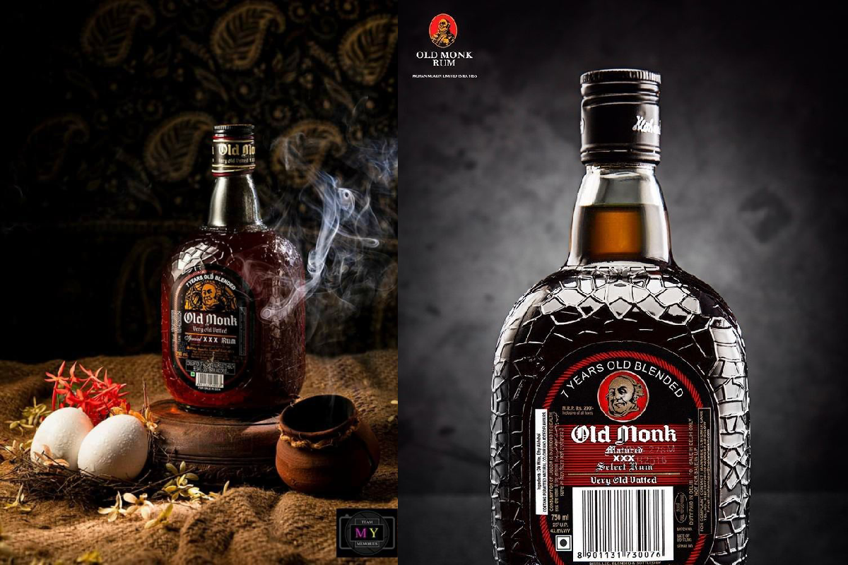
The imagery featured here turns the familiar rum bottle into the centre of a dramatic visual composition, using dark backgrounds, warm amber tones, smoke and traditional Indian-inspired elements to create a rich, nostalgic atmosphere.
A Bottle With a Distinctive Identity
The first thing that catches the eye is the bottle itself.
Its dark, rounded form and distinctive textured surface give it a character that immediately separates it from a conventional glass bottle. The iconic label and monk portrait create another strong visual anchor.
In the second image, the bottle is photographed almost like a luxury product, with controlled lighting highlighting its contours and reflective surface.
This demonstrates an important principle of branding: recognition can come from shape and visual consistency just as much as from a logo.
Dark Colours Create a Sense of Nostalgia
The visual palette is dominated by deep blacks, browns and amber tones.
That colour combination creates a distinctly vintage atmosphere. Rather than using bright, contemporary advertising colours, the imagery leans into warmth and darkness.
The amber liquid becomes one of the brightest elements in the composition, naturally drawing attention toward the bottle.
The result is a visual language built around heritage, warmth and nostalgia.
Smoke Adds Drama
The smoke surrounding the bottle in the first image creates an almost cinematic effect.
It introduces movement into an otherwise static composition and gives the photograph a mysterious quality. Against the dark background, the lighter smoke becomes particularly visible.
From a photography perspective, this is an effective technique because it creates another layer between the foreground product and the background.
Traditional Elements Strengthen the Story
The first composition goes beyond simply photographing the bottle.
The burlap-like surface, traditional-looking vessel, flowers and other rustic elements create a distinctly Indian visual setting.
These details establish a sense of place and nostalgia. Instead of presenting the product in a completely sterile studio environment, the composition surrounds it with objects that suggest tradition and craftsmanship.
The result feels more like a heritage-inspired still life than a conventional product photograph.
The Monk Illustration as a Branding Signature
The illustrated monk on the label is arguably the most recognisable visual element.
A character-based logo can be particularly powerful because it gives a product a face and personality. Rather than relying entirely on typography, the imagery creates an immediate visual association.
In the photographs, the monk illustration remains visible even when the bottle is surrounded by dramatic lighting and shadows.
That is a testament to the strength of a distinctive brand identity.
Product Photography Meets Storytelling
The two images demonstrate two very different approaches.
The first is atmospheric. It uses props, texture, smoke and a dark setting to create a story around the bottle.
The second is much more direct. The bottle dominates the frame, with dramatic lighting emphasizing its surface and label.
Together, they show how the same product can be photographed in completely different ways while retaining its recognizable identity.
Why Packaging Matters
Packaging is often the first interaction between a consumer and a product.
A distinctive bottle can become part of a brand’s identity, particularly when its shape, label and colours remain consistent over time.
In this case, the bottle’s silhouette, dark glass, textured appearance and illustrated label work together to create a memorable visual identity.
That consistency can be especially valuable for heritage brands because the packaging itself becomes part of their story.
A Vintage Aesthetic in a Modern Visual World
Modern advertising often favours minimalism, clean backgrounds and highly polished compositions.
The imagery here takes a different direction.
It embraces texture, shadows, rustic surfaces and dramatic lighting. This creates a vintage-inspired atmosphere while still feeling suitable for contemporary digital photography.
That balance between old and new is one reason heritage aesthetics continue to appear in modern branding and editorial photography.
The Art of Creating a Memorable Brand Image
The photographs highlight several techniques that can make product imagery visually compelling:
- Strong contrast between light and dark
- A limited, consistent colour palette
- Distinctive packaging
- Atmospheric elements such as smoke
- Textured backgrounds
- Cultural or heritage-inspired props
- Close-up product framing
- Controlled highlights and reflections
None of these elements needs to dominate individually. Their effectiveness comes from working together.
Final Thoughts
The Old Monk imagery demonstrates how branding, packaging and photography can combine to create a strong visual identity.
The dark palette, amber tones, distinctive bottle, monk illustration and traditional-inspired props create a world that feels nostalgic and instantly recognisable.
Whether viewed as product photography or as a study in heritage branding, the images show an important lesson for marketers and photographers alike:
A memorable product image doesn’t simply show what a product looks like—it creates an atmosphere around it.

Comments are closed.