

Few beverage images communicate refreshment, energy and celebration as instantly as a bottle covered in condensation and surrounded by ice.
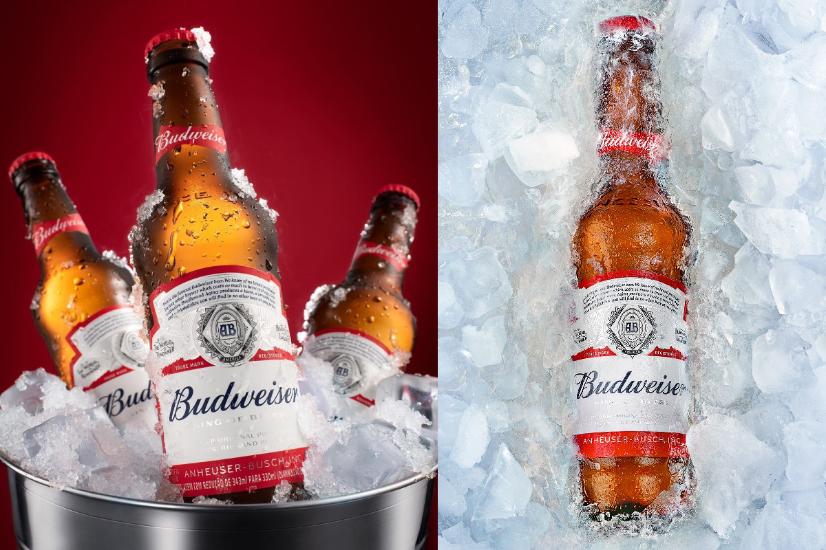
The Budweiser visuals featured here take that familiar idea and turn it into a polished advertising-style composition. With glowing amber bottles, crisp ice, condensation and a bold red backdrop, the imagery focuses on one simple message: cold beer is an experience.
The Power of Red
The first image immediately establishes Budweiser’s visual identity through its dominant red background.
Red creates energy and intensity, while the warm amber tones of the bottles provide a natural contrast. The result is a composition that feels vibrant without becoming visually complicated.
The red-and-white branding on the bottles fits naturally into this colour palette, allowing the packaging to remain instantly visible.
Condensation Creates the Feeling of Cold
One of the most effective details in the image is the condensation covering the bottles.
Tiny water droplets catch the light across the glass, immediately communicating freshness. Even without seeing the beer being poured, the viewer can almost imagine the sensation of picking up an ice-cold bottle.
This is a classic principle of beverage advertising:
Don’t just show the product—show how it feels.
Ice Becomes Part of the Story
The bottles are surrounded by large pieces of ice, making temperature the central visual theme.
The contrast between the warm amber colour of the beer and the cool white and blue tones of the ice creates a strong visual relationship.
Warm bottle.
Cold environment.
Immediate refreshment.
The second image takes this idea even further by placing the entire bottle inside a bed of ice.
The Bottle as the Hero
The central bottle in the first composition is positioned prominently in the foreground, while the other bottles sit slightly behind it.
This creates a clear visual hierarchy.
The viewer’s eye naturally moves toward the central bottle first, then toward the surrounding bottles and finally the ice bucket.
It’s a simple but effective product-photography technique: one hero product supported by secondary elements.
The Ice Bucket Adds a Premium Touch
The metallic ice bucket introduces another texture into the composition.
The reflective surface contrasts with the rough texture of the ice and smooth glass bottles. This combination creates depth and makes the image feel more polished.
It also suggests a social setting—something associated with gatherings, celebrations and shared moments.
The Second Image Takes a More Minimal Approach
While the first composition presents multiple bottles, the second focuses almost entirely on one.
The bottle is surrounded by ice from edge to edge, creating a cleaner and more concentrated visual.
This approach makes the packaging the unmistakable focal point.
The white ice also provides a strong background against which the red label and amber liquid stand out.
Classic Packaging, Modern Photography
One of the strongest elements of the images is the contrast between classic packaging and contemporary photography.
The familiar bottle shape and label provide brand recognition, while dramatic lighting, close-up framing and carefully arranged ice give the imagery a modern advertising feel.
This demonstrates why strong packaging can remain visually effective across different generations of advertising.
Why Beverage Photography Relies on Texture
Texture plays a major role in both photographs.
There is:
- Smooth glass
- Rough ice
- Water droplets
- Reflective metal
- Glossy labels
- Amber liquid
Each surface reacts differently to light.
That variation keeps the image visually interesting even though the subject is relatively simple.
Light Turns the Beer Into the Focal Point
The warm lighting passing through the amber bottles creates an inviting glow.
Against the darker red background, the bottles almost appear illuminated from within.
This is particularly effective because the human eye naturally notices contrast. The bright highlights on the bottles guide attention toward the product while the darker background keeps distractions to a minimum.
A Visual Language Built Around Refreshment
The entire campaign-style aesthetic can be reduced to a few simple visual ideas:
Cold. Crisp. Bold. Refreshing.
Every element supports those ideas.
The ice communicates temperature.
The condensation communicates freshness.
The red communicates energy.
The amber glass communicates the beverage.
The familiar label communicates the brand.
That’s what makes the composition work so effectively.
The Art of Product Advertising
These images demonstrate that successful product photography doesn’t necessarily require an elaborate story.
Sometimes, the story is already contained within the product.
For a chilled beer, the photographer only needs to emphasize the qualities consumers associate with the experience: coldness, freshness, flavour and social enjoyment.
The challenge is turning those abstract ideas into something visible.
Here, ice and condensation do exactly that.
Final Thoughts
The Budweiser visuals show how powerful simple advertising concepts can become when executed with strong composition and lighting.
A bottle, some ice and a carefully chosen background may sound straightforward, but the combination creates a highly recognizable visual story.
The imagery succeeds because it doesn’t overcomplicate the message.
When the product is the experience, sometimes the best advertisement is simply making people feel it before they even open the bottle.

Comments are closed.